



Most people who cite a monitoring framework never read its annex. That is not a criticism — annexes are long, and the point of a framework is that you can use its output without reconstructing its construction. But the construction is where the judgements live, and in the case of the ECB–ESRB geoeconomic report the workstream wrote enough of them down that you can follow the reasoning from 38 candidate indicators to the handful that actually appear.
What follows is that walk-through. It is descriptive. I am not going to argue that the framework should have done something else, partly because the case for that is weaker than it first looks, and partly because the interesting thing here is how much of the design turns out to be visible once you go looking — and how much doesn’t.
The occasion for looking was a small question I could not answer. On 31 July the Federal Reserve Bank of New York sold euros to buy yen on behalf of the US Treasury, in the first joint US–Japan operation to support the yen in nearly thirty years. Japan’s Ministry of Finance confirmed three days later that it had purchased yen in coordination with the US Treasury that day. The Financial Times reports that the ECB was told after the trade had been executed, and that Christine Lagarde and Treasury Secretary Bessent spoke the following day; it also reports senior ECB officials describing the use of euros as an unprecedented breach of longstanding conventions between western monetary authorities. A Treasury spokesperson told the paper that decisions on allocating the Exchange Stabilization Fund are made by the Treasury, are not coordinated with foreign authorities, and that reserve assets within the fund had been reallocated that week.1 No transaction amount has been published.
Set the diplomacy aside — others are better placed to weigh it, and I have no standing to. What it left me with was a narrower and duller question. If the euro’s position in the international monetary system is the kind of thing that turns out to matter on a Friday afternoon, what does the euro area’s own geoeconomic framework say about it? Specifically: what share of allocated official foreign exchange reserves is held in euro, and which way is it going?
The framework has a series for that. It sits in the report’s main indicator table. It appears in neither of the two derived outputs the report produces. Following that led into the selection process, which turned out to be the more interesting object.
The episode, briefly, and why it does not carry weight
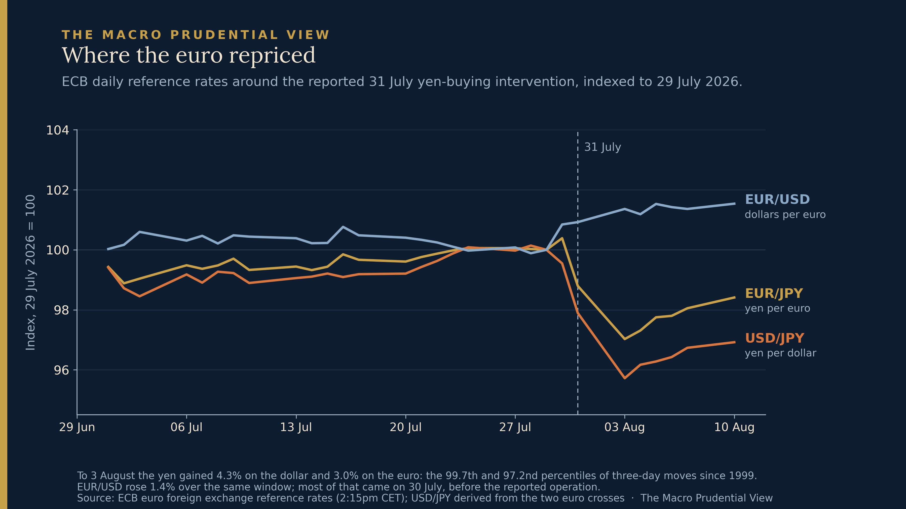
Across the fixes from 29 July to 3 August the yen appreciated 4.5% against the dollar and 3.1% against the euro, with EUR/USD up 1.4%.2 Those are large moves and they are broad yen appreciation rather than anything euro-specific. A euro sale would, other things equal, push EUR/USD down rather than up; that it rose tells you nothing either way without the transaction size and the other flows in the market that week, which is roughly the point.
The reported rationale for using euros rather than dollars is that dollar sales could have been read as an attempt to weaken the currency, against the Treasury’s stated strong-dollar policy. Analysts have separately estimated, from provisional Bank of Japan data, that Japan alone may have spent around ¥13.8tn over two days; no figure has been published for the US side.
Attribution of the price action is beyond what daily data can support, and the fixing calendar is the reason. ECB reference rates come from a concertation procedure normally conducted at 14:15 Central European Summer Time, which is 08:15 in New York — the start of the New York session rather than through it. An execution for the Treasury on Friday 31 July would more naturally appear in Monday’s fix than Friday’s. Monday is indeed the larger single move. None of that identifies anything, and I will not pretend otherwise. The episode is the reason I opened the annex, not evidence for anything in it.
Thirty-eight candidates, two outputs
The ECB and ESRB published Financial stability risks from geoeconomic fragmentation on 22 January 2026, with a separate technical annex. The report classifies geopolitical risks into six categories — general, military conflict, infrastructure, trade, capital and finance, and politics and society — and assembles 38 indicators across them, drawn from news-based indices, model-based estimates, official statistics and event counts.
From that pool, two things get built, and they are parallel rather than sequential. Box 2 recommends sixteen indicators for closer monitoring, and Figure 4 displays fifteen of them as a heatmap, the drop of one being the local-perception geopolitical risk indicator, set aside as capturing country-specific rather than regional or global risks while being retained in the recommended set. Separately, the workstream augments the ESRB growth-at-risk apparatus with geopolitical variables, using a LASSO-regularised quantile regression to select among candidates, with a benchmark specification taking one indicator per topical category — five indicators covering five of the six, with infrastructure unrepresented. An indicator can be in one without being in the other; neither is a filtered version of the other.
These are exhibits in a report recommending a monitoring set, not a live dashboard someone opened on 31 July. Worth saying plainly, because it changes what the omissions mean.
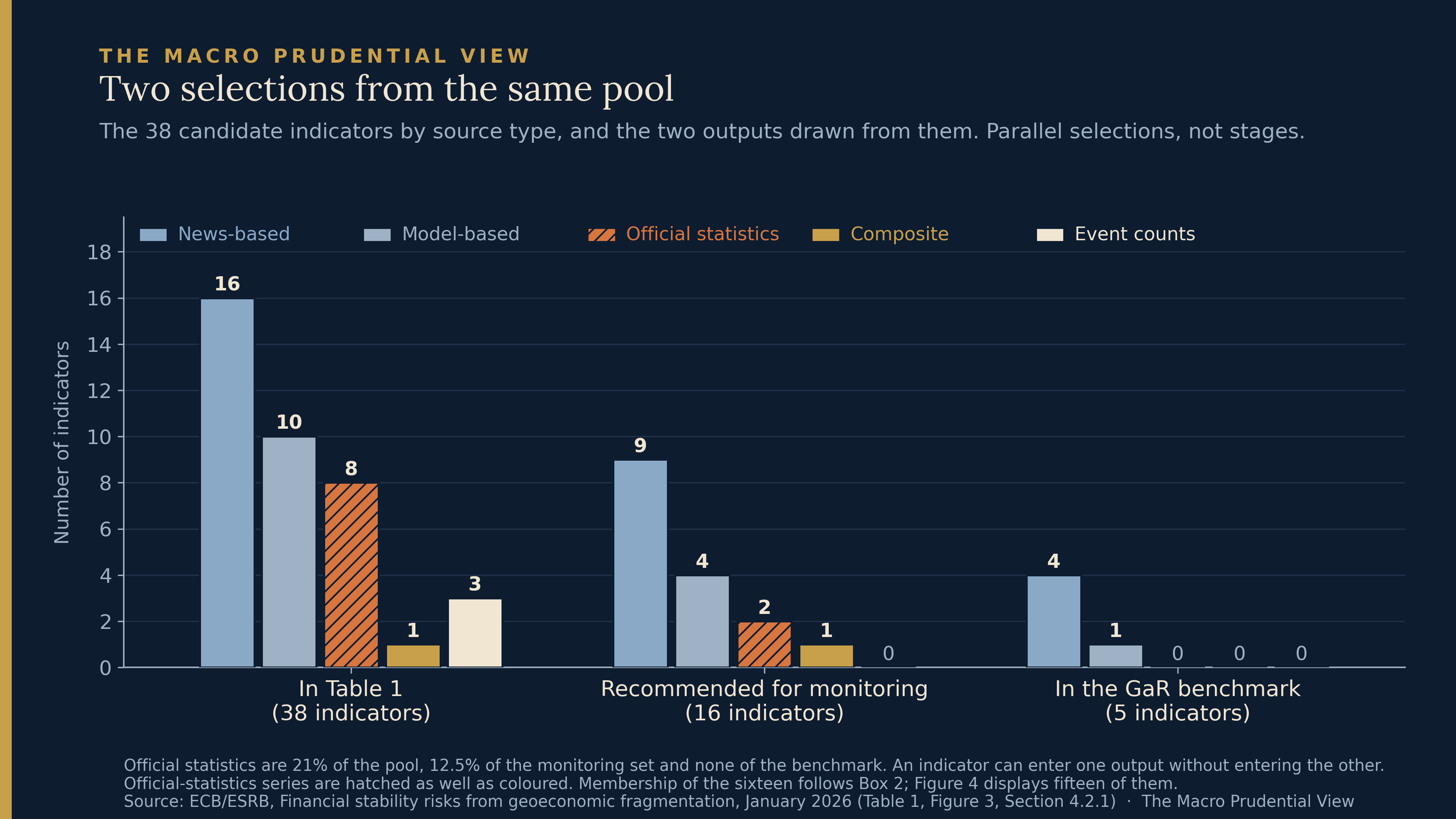
Both outputs are thinner in official statistics than the pool they draw on, and they are thinner to very different degrees. Official statistics are eight of the 38, two of the sixteen recommended for monitoring, and none of the five in the growth-at-risk benchmark. News-based indices run sixteen, nine and four. The monitoring set keeps some official statistics; the modelling benchmark keeps none.
The growth-at-risk end of that has a straightforward candidate explanation. The machinery estimates the conditional distribution of future GDP growth, so relevance for GDP tail risk is the criterion. Why news-based indices dominate the result is a further question the annex does not settle: they move fast and load on the same news that moves markets, but regularised selection among correlated candidates can also be sample-dependent, and a set of news indices proxying one latent factor could crowd out slower series without any of them being economically preferred. A measure of how much euro is held as reserves abroad is not built to forecast GDP four quarters ahead.
The shortlist end is more interesting, because the report shows its reasoning.
What Box 2 actually says
Box 2 justifies each recommended indicator in turn, and thirteen of the sixteen are argued on predictive relevance at a stated horizon — the report’s own term, and worth keeping rather than upgrading to forecasting performance, since what the annex reports is relevance within its estimation exercise rather than out-of-sample evaluation. The Economic Policy Uncertainty Index has predictive value at short horizons of up to one year. The World Uncertainty Index shows predictive strength up to a year. The Trade Policy Uncertainty Index is a strong predictor at the one-year horizon. The JLN Financial Uncertainty Index has predictive value up to a year. The Migration Fear Index has predictive relevance up to eight quarters, the Sanctions Intensity Index over the same horizon, the Elections EMV Tracker up to a year. The Common Volatility Index has weaker but still notable relevance at quarterly horizons. The Global Supply Chain Pressure Index showed predictive relevance only when the COVID-19 period was excluded from the estimation sample, which is a candid thing to write down. Four more are argued the same way: the JLN Real Uncertainty Index provides short-term signals for tail-risk assessment, the local-perception geopolitical risk indicator has predictive strength most evident at a year and longer, the National Security EMV Tracker shows more relevance at one-year horizons than in the short term, and the Financial Fragmentation Index shows some predictive strength at one year in first differences.
Three are not argued that way, and the Box says so openly.
The Geopolitical Risk Index is retained while the Box notes it does not show high predictive power for economic activity, possibly because its data origins lie in Anglo-Saxon news sources. The Significant Cyber Incidents Indicator is retained while the Box notes its empirical use is limited owing to its short time series, on the ground that it captures an increasingly important dimension of modern conflicts. And the Trade Openness Indicator is admitted with no horizon and no predictive claim at all, described as a widely used official statistics measure that reflects both the vulnerabilities of countries to geopolitical events and the reactions to these events.
So predictive relevance is not a hard gate. Indicators enter this shortlist when the workstream judges the thing they measure to matter, and it says which ones those are and why. That is a defensible way to build a monitoring set, and it answers an objection a purely statistical selection would run into: a set chosen only on measured relevance drops exactly the risks that have not yet materialised. It is also, as documentation goes, unusually honest.
The series that isn’t there
Which brings back the question I started with.
The Allocated Foreign Exchange Reserves indicator tracks reserve currency composition from IMF COFER data. It is in the report’s main indicator table. It is quarterly, so the frequency reasoning the annex applies to annual series — military expenditure, the sanctions count, capital restrictions, UN voting alignment — does not reach it. On the published record it appears in none of the growth-at-risk screening tables: not the multicollinearity summary, not the unit root tests, not the LASSO relevance table, not the model-fit ranking. The annex does not state whether it was among the candidates screened at all. And it is not among the sixteen.
I cannot tell you why, and neither can anyone else working from the published documents. What I can do is set out the reasons a workstream might reasonably have left it out, because they are not hard to find.
A COFER share is a stock whose period-to-period changes mix valuation with transactions: the euro share can fall because holders sold euro, or because the dollar rose and revalued everyone’s holdings. It identifies no holder, no instrument, no counterparty. It is a global aggregate, not a euro-area exposure. Its denominator is allocated foreign exchange reserves — the portion of foreign exchange reserves whose currency composition reporting authorities disclose. Unallocated reserves are foreign exchange too, just undisclosed; gold, SDRs and the IMF reserve position sit outside foreign exchange reserves altogether. Those are plausible considerations. What the record does not show is their weight, or whether any of them was applied, or whether the series was put to the shortlist test at all. Absence from a published table shows non-appearance, not rejection.
One candidate explanation can be ruled out, which is worth noting for what it says about the others. A display of levels cannot show a risk that materialises as a decline. True — and true of trade openness, which is on the heatmap anyway, handled in ordinary dashboard practice by showing the change alongside the level. Whatever kept the reserves series out, it was not that.
For the record, the series itself gives a straightforward answer to the question I started with. The euro is a shade over 20% of allocated official foreign exchange reserves as at the first quarter of 2026, and it has sat between roughly 19% and 20.6% every quarter since 2017 — remarkably flat through the pandemic, through 2022, and through everything since. Whatever else is true, the number is not doing anything dramatic. That is worth knowing, and the framework would not have told you.
What the walk-through does show is how much the answer depends on judgement that a reader outside the workstream cannot reconstruct. Thirteen are in on reported predictive relevance, and the Box gives the horizons. Three are in because someone decided the thing they measure matters, and the Box says so. The rest are out, and for most of them the record is silent about which of those two tests they failed.
Coverage and timing
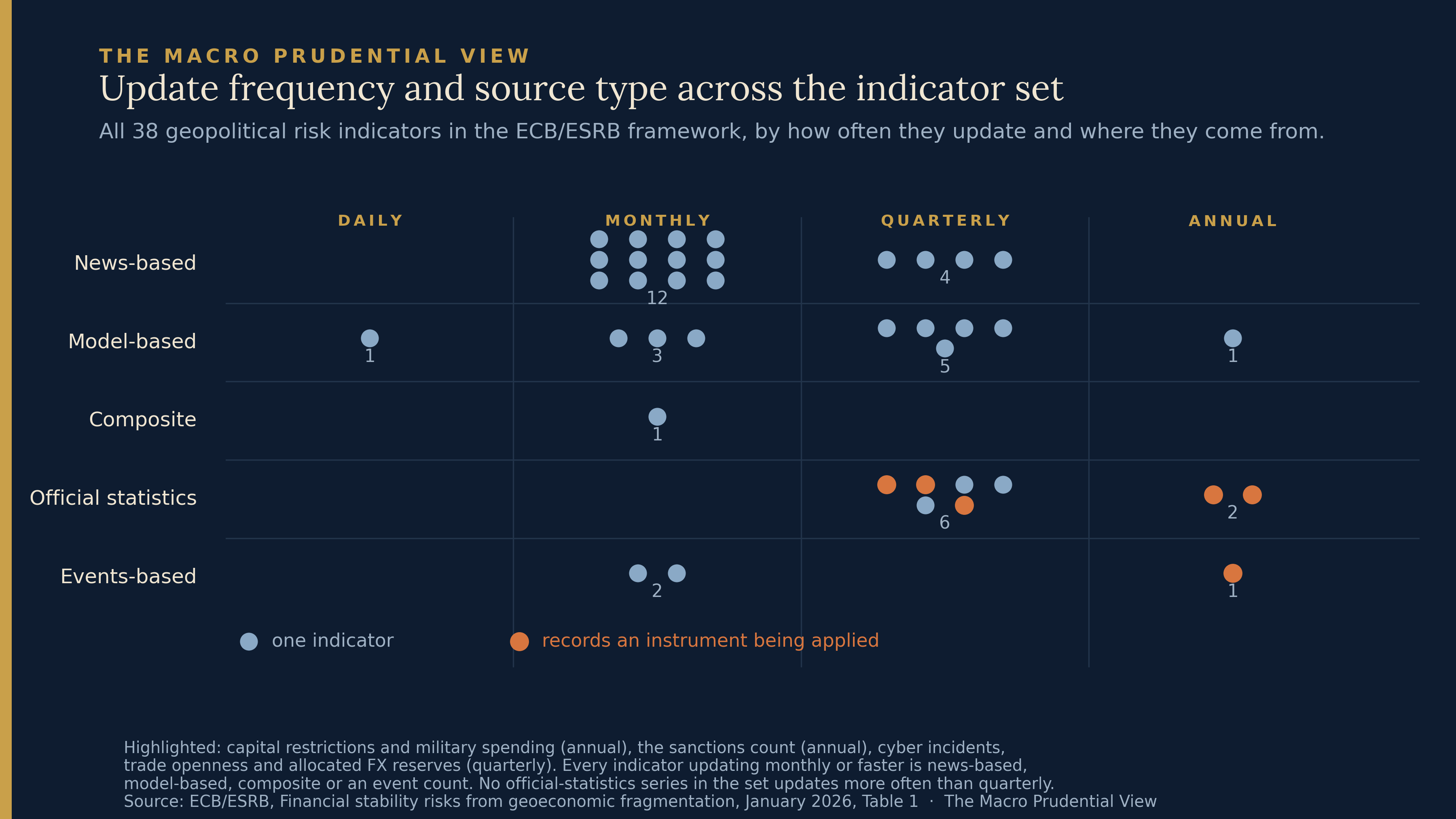
Two descriptive patterns are worth having in front of you, offered as description rather than diagnosis.3
The first is timing. One indicator updates daily, a model-derived common volatility factor. Eighteen update monthly, twelve of those news-based indices. Fifteen are quarterly, four annual. No series drawn from official statistics updates more often than quarterly, and the three that record an instrument being applied — capital restrictions, military spending, the count of active sanctions — are annual.
That association between source type and frequency is real and unsurprising: news and market data are generated continuously, official statistics are compiled on a calendar. It is not evidence of a selection preference by itself, and the annex is explicit that frequency constraints informed which indicators were excluded from the final empirical subset. Annual frequency genuinely is a problem for a quarterly-horizon model, and saying so is not a criticism.
The second is coverage. Military conflict carries nine indicators in the main table, trade six, sanctions two, capital and finance eight. Of the capital-and-finance eight, four reach the heatmap: two uncertainty and volatility measures and two cross-border flow ratios. The two official-statistics series in the category — the Capital Restriction Index and the reserves indicator — reach neither derived output.
One caution about reading counts. The annex reports that most military and infrastructure indicators were not selected at any horizon in the growth-at-risk work, adding little beyond the core controls. The richest-covered category contributes the least. Coverage and usefulness are different axes, and a bigger row count is not a better category.
The thing in the annex
The most interesting object in either document is not in the indicator set at all.
Box A.1 constructs a financial position-weighted effective exchange rate, following Lane and Shambaugh, weighting bilateral exchange rates by their importance in cross-border financial positions rather than in trade. The construction matters as much as the result. Because the weights come from cross-border positions, the exercise can be run separately for the asset side and the liability side, and separately by financial instrument and by holding sector. That is what turns an exchange rate into something you can say things about institutions with.
Applied to German data, around 40% of the asset side and 20% of the liability side of the international investment position are denominated in foreign currency, with the dollar accounting for more than half of both. Germany is a net creditor with a large share of foreign-denominated assets, so the asset-based indicator is far more sensitive to an exchange rate shock than the liability-based one. Splitting by sector, the net foreign-currency creditor position comes primarily from non-bank financial intermediaries, while the monetary financial institutions’ balance sheet appears currency matched.
Then the instrument breakdown does something the sector aggregate could not. The box reads the high volatility of the indicator for short-term bonds held by MFIs as revealing their short-term funding needs in foreign currency — a conclusion that only becomes visible once the measure is cut by instrument rather than by sector. On the non-bank side, the higher variability of asset-weighted rates, driven by equity holdings, may amplify the transmission of a geopolitical shock. Set alongside evidence that non-banks have been accelerating their hedging of these exposures through banks using short-term FX derivatives, the box says this supports calls for MFIs to have arrangements in place for swift access to central bank cross-currency swap lines.4
That is a different kind of object from anything in the indicator set. An index tells you a level. This starts from a currency movement, attaches it to positions, splits those by sector and by instrument, and arrives at a specific institutional exposure and the facility that would matter if it bound. It is partial — it does not identify a state’s decision to act, or quantify losses — but it runs from a quantity to who is exposed to it, which no row on a heatmap does.
It was built by the authors of the report, demonstrated on one country’s data, and left in an annex.
Extending it is not one project but two, and they should not be quoted at the same price. A macro version at aggregate or sectoral level would draw on international investment position currency breakdowns and existing securities-holdings and portfolio-investment statistics; whether those suffice is a data-gap question I have not tested. A holder-level map, which is what would actually attach a currency move to identifiable institutions, is the harder object and the one where look-through and harmonised reporting bind. The German case is unusually well served by its statistics. The method is written; the feasibility of each version beyond Germany is an exercise someone should run.
What the walk-through leaves you with
There is a supervisory exercise that runs the other way round from a scenario test, and it was published on the same day as the reported operation. On 31 July 2026 ECB Banking Supervision released the results of its thematic reverse stress test on geopolitical risks, covering 110 euro area banks under its direct supervision. Banks were given a fixed adverse outcome — 300 basis points of CET1 depletion — and asked what geopolitical path would get them there. That is the inverse of the biennial EU-wide exercise, where every bank faces the same scenario and the question is the size of the capital impact. Structure enters as the transmission each bank has to specify to make its own scenario work, not as the starting point.5
Banks produced narratives rather than readings: military conflicts, trade and energy disruption, sanctions, macroeconomic shocks, cyber incidents, each tailored to a bank’s own business model. The ECB found the scenarios generally economically meaningful, and also found weaknesses — among them, that several banks produced only a muted response in their liquidity metrics despite the significant capital decline the scenario specified, which the ECB will follow up because solvency and liquidity stress are closely intertwined in a crisis.
I offer that as an existence proof rather than as an argument. The euro-area official sector does ask structure-to-outcome questions; it is not the case that only gauges exist. What is not evident from the published material is any connection between that exercise and the indicator framework — between the scenarios banks wrote in July and the series the January report recommends monitoring.
Which is where the walk-through actually lands. The report’s own conclusion says gaps remain, that indicator availability and comparability vary across countries and over time, and that it could be worthwhile to complement indicator-based monitoring with more elaborate scenario analyses involving specific risk materialisations. Read against the annex, that is a more pointed sentence than it looks, though it is worth being precise about what would answer it. Box A.1 is not scenario analysis; it is a structured exposure measure, a third kind of object alongside the indicator set and the July supervisory exercise. The report asks for scenarios. The annex demonstrates an exposure metric. The reverse stress test elicits bank-specific narratives. Three different instruments, none of which is a longer indicator list, and only one of which the January report actually built.
The broader point is duller and, I think, more useful. A monitoring framework is a sequence of judgements, most of which never reach the people who read its outputs. This one wrote down more of them than most — the horizons, the failures, the three admissions on grounds other than performance, the reason a country-specific index was dropped from a global display. Anyone using the output is inheriting those judgements whether or not they have read the annex. That is not an argument for reading annexes. It is an argument for the workstream having written this one the way it did.
Paweł Fiedor — The Macro Prudential View
Market data are as at 10 August 2026.
The author works at the Central Bank of Ireland and in the ESRB Secretariat. This piece is written in a personal capacity; views are the author’s own and should not be attributed to the Central Bank of Ireland, the ESRB, or the Eurosystem. It draws exclusively on publicly available sources and takes no position on whether the measures discussed should be adopted.
Sources: ECB and ESRB, Financial stability risks from geoeconomic fragmentation, 22 January 2026, in particular Box 2, Figure 4 and its note, and Table 1 — https://www.esrb.europa.eu/pub/pdf/reports/esrb.report202601_financialstabilityrisks.en.pdf; and the accompanying technical annex, including Table A.1, the growth-at-risk selection tables and Box A.1 — https://www.ecb.europa.eu/pub/pdf/other/ecb.report202601_financialstabilityrisks_annex.en.pdf; European Central Bank, euro foreign exchange reference rates, daily series — https://www.ecb.europa.eu; International Monetary Fund, Currency Composition of Official Foreign Exchange Reserves (COFER) — https://data.imf.org/en/datasets/IMF.STA:COFER; Japan Ministry of Finance, statement on coordinated yen purchases, 3 August 2026 — https://www.mof.go.jp/english/public_relations/statement/others/20260803073000.html; Reuters, “US Treasury Secretary Bessent will do whatever it takes to support Japan”, 4 August 2026 — https://www.reuters.com/world/asia-pacific/us-treasury-secretary-bessent-will-do-whatever-it-takes-support-japan-2026-08-04/; Financial Times, “US euro sale to prop up yen blindsided ECB”, August 2026 — https://www.ft.com/content/d9922d0b-51a0-48be-811b-42e08f90985a; ECB Banking Supervision, “ECB publishes results of 2026 geopolitical risk reverse stress test”, 31 July 2026 — https://www.bankingsupervision.europa.eu/press/pr/date/2026/html/ssm.pr260731~93964644b0.en.html; P. R. Lane and J. C. Shambaugh, “Financial exchange rates and international currency exposures”, American Economic Review, 2010. Chart data as cited in each figure.
Financial Times, “US euro sale to prop up yen blindsided ECB”, August 2026, reporting on several people familiar with the matter; and Reuters, 4 August 2026, for Secretary Bessent’s acknowledgement of US participation and his description of the move as a reallocation of resources. The Treasury statement quoted by the FT confirms a reallocation of Exchange Stabilization Fund reserve assets without naming the currencies. The first full official account of the US side would be the New York Fed’s quarterly report on Treasury and Federal Reserve foreign exchange operations covering the third quarter of 2026.
Computed from ECB euro foreign exchange reference rates, USD and JPY against the euro, fixes of 29 July and 3 August 2026, as simple percentage changes: EUR/USD +1.36%, yen +4.47% against the dollar, +3.07% against the euro. USD/JPY is derived from the two euro crosses at the same daily observation, so the three figures satisfy the triangular identity.
Category, source-type and frequency counts are the author’s tabulation of Table 1 in the technical annex. Heatmap membership follows Box 2 and Figure 4. The number of indicators quoted in the report varies by table and by count; figures here are per category against the specific table named.
The chain from instrument-level volatility to funding needs to swap-line access is Box A.1’s own, not an extrapolation from the indicator. The box is explicit that weighting by cross-border positions is what allows transmission to be analysed separately for assets and liabilities and by instrument and holding sector, following Lane and Shambaugh’s construction of asset- and liability-side financial effective exchange rates.
ECB Banking Supervision, “ECB publishes results of 2026 geopolitical risk reverse stress test”, 31 July 2026. Geopolitical risk is a supervisory priority for 2026-28. The simulation was integrated into the data collection banks would otherwise have submitted under their internal capital adequacy assessment process, reducing compliance costs; the design was the ECB’s and the scenarios the banks’ own. A 300 basis point CET1 depletion consumes management buffers rather than implying failure, and the exercise will not lead to adjustments in Pillar 2 guidance.